Helping oceanographers build visualization standards
03
Responsibility
User Research, Tableau Prototyper, Front end developer
Timeline
2 weeks
A pilot project for standardizing oceanographic visualization specification. Our scoped problem strives to illustrate the best practices of visualization for most commonly used oceanographic parameters like salinity and wind speed.
Goal
How can we help oceanographers intuitively explore and understand common oceanographic data?
Oceanographers have to deal with common parameters in their data. For example salinity and wind speed. Our project is a pilot proposal to make visualization standard for oceanographic data. Standardization helps in making tools which enable developers to collaborate with oceanographers. Genomics, for example, has benefited by having a visualization standard which enabled people working beyond genomics to contribute to genomics research. We aim to bring the same productivity through standardization.
Scoped real world problem
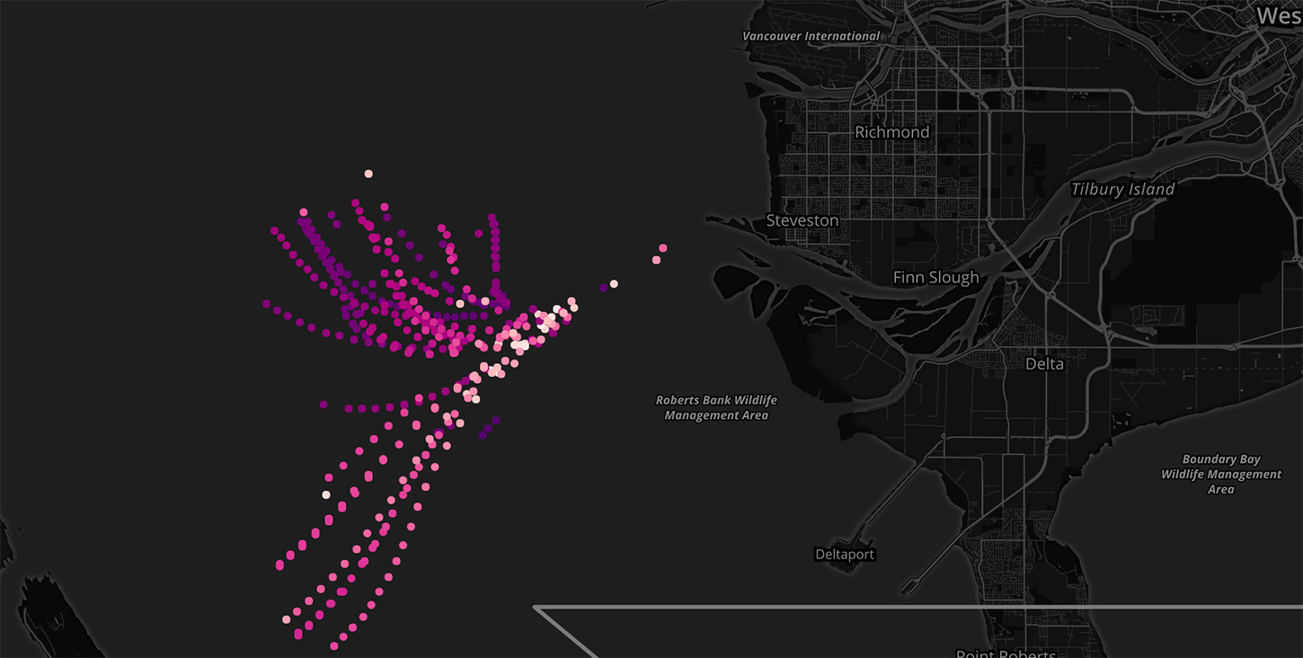
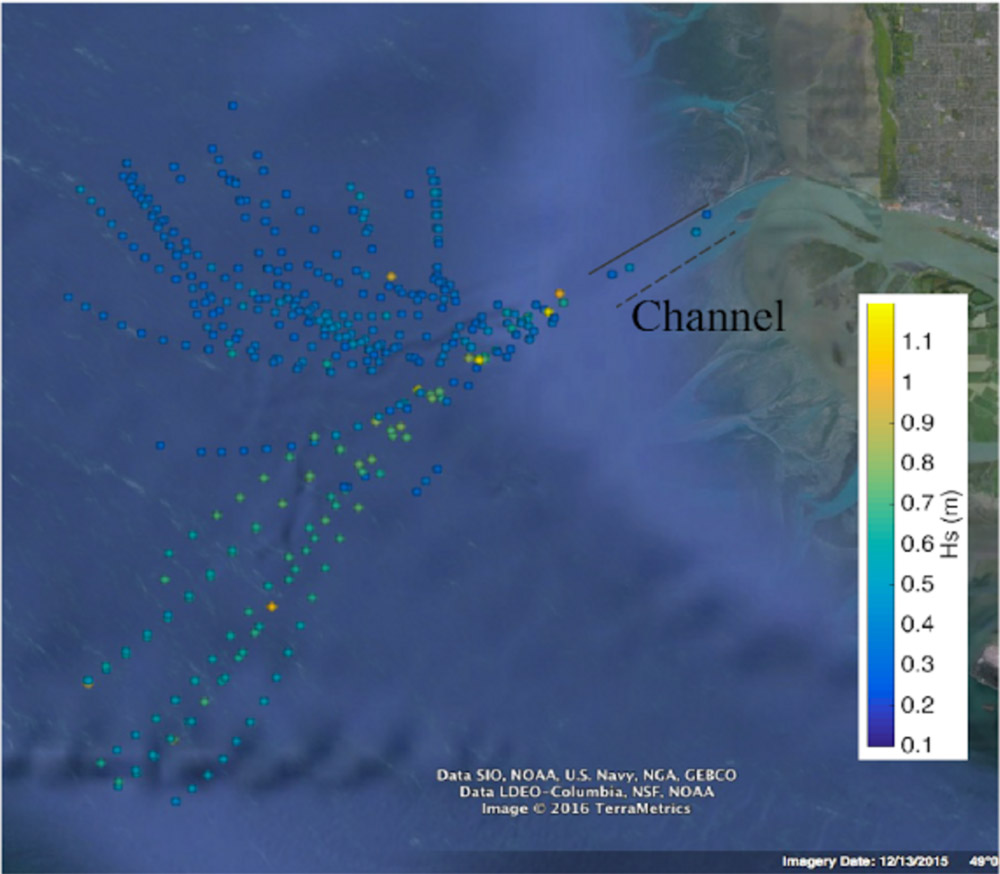
Densely populated coastal areas are often situated at the river mouths, and gaining an understanding of how river water mixes with ocean water can be key to understanding coastal pollutant, nutrient, and sediment transport in these areas. The tool we are developing aims to aid researchers in understanding how the Fraser River plume (near Vancouver, BC) mixes under different physical forcing conditions. These conditions include wind speed, wind direction, tidal phase, and tidal magnitude.
Dataset
SWIFT Buoy
SWIFT buoys deployed in Fraser River to collect high dimensional oceanographic data.
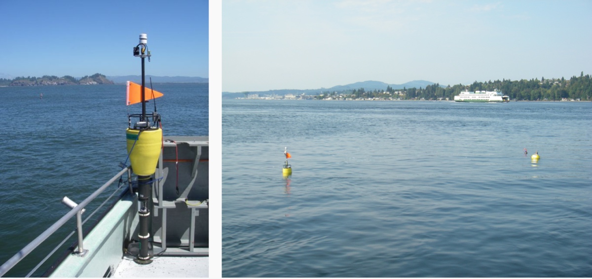
The Fraser River plume data was collected from specialized drifting buoys developed by Jim Thomson’s lab, called Surface Wave Instrument Floats with Tracking, or SWIFTs. The array of sensors in the SWIFTs and resulting highly dimensional data makes analysis complicated. The methods employed to process, encode, and ultimately understand the data had significant room for improvement.
The lab research aims to understand how the river plumes mix under different physical forcing conditions. These conditions include wind speed, wind direction, tidal phase, and tidal magnitude, surface and depth salinity. To capture these conditions, UW researchers deployed drifting SWIFT buoys during a 10-day field campaign for several hours each day near the mouth of Fraser River.
Research
Understanding user goals and existing workflows
Our first step was to understand the current workflow which researchers are using and what kind of questions do they have with their data. We did this by observing three participant’s workflow while we asked them specific questions about their process. Cognitive Walkthrough also helped in understanding minor but important behaviors of how a specific task is done. For example the participant kept making different visualization scripts for each day although it could be done with multiple layers.
The participant’s workflow was cleaning data using Matlab scripts and exporting it as Google Earth Slides. It is a multi-step process with poor visualization at the end.
Poor Readability
Current Visualization methods do not use best practices and has poor readability
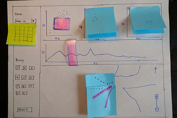
Participatory Sketching
After the cognitive walkthrough we used participatory sketching with our participant where we encouraged him to sketch
- Tools they wished they had.
- How will it solve their questions?
This helped in understanding our participants pain points and how can we bridge the gap between what the participants say they want and what they do to find answers to their goals.
Designing collaboratively
A participant draws what his ideal workflow should look like.
Key Findings
- Participants always looked at Surface Salinity vs Depth Salinity charts first to determine the validity of the entire dataset.
- Participants with their data exploration did complex queries which were always combining two conditions (equivalent to SQL AND).
- All participants ignored certain parameters like Atmospheric pressure but still encoded them in their visualization, making it difficult to interpret the final result.
- Participants used rainbow color schemes for most parameters. Due to how human perception works, rainbow colors is not the best way to encode data.
Ideation
Data Exploration
Before considering a layout direction, we wanted to explore the data and how can it be best visualized to find
- Visualizations which best support the data by their properties (timeline vs bins vs circular ranges)
- Visualizations which supports pattern finding
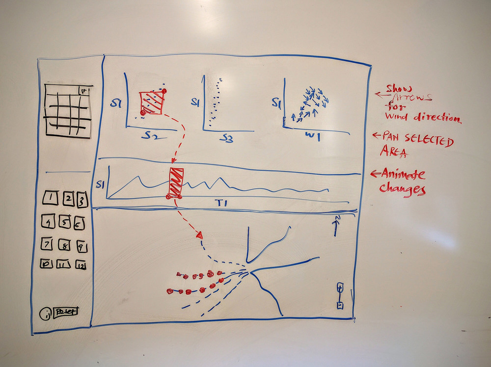
Storyboarding the interaction
At this point, we knew which data dimensions matter the most to our users and their typical workflow around the kind of questions they have. We wanted to lay out information hierarchically to support the common tasks which our users had.
Testing
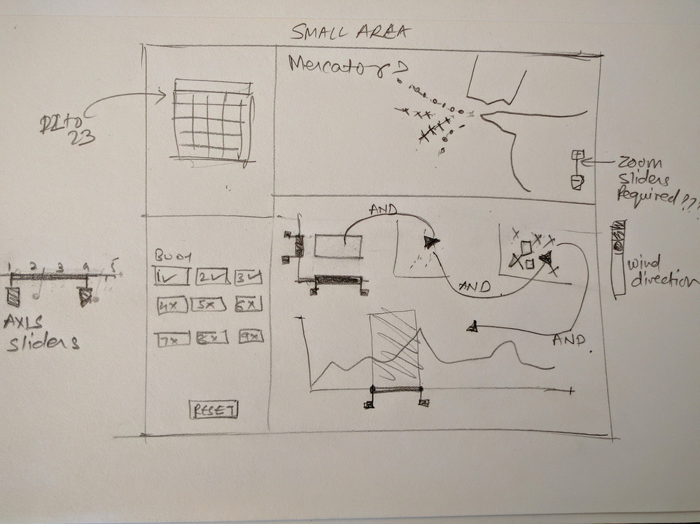
Paper Prototype
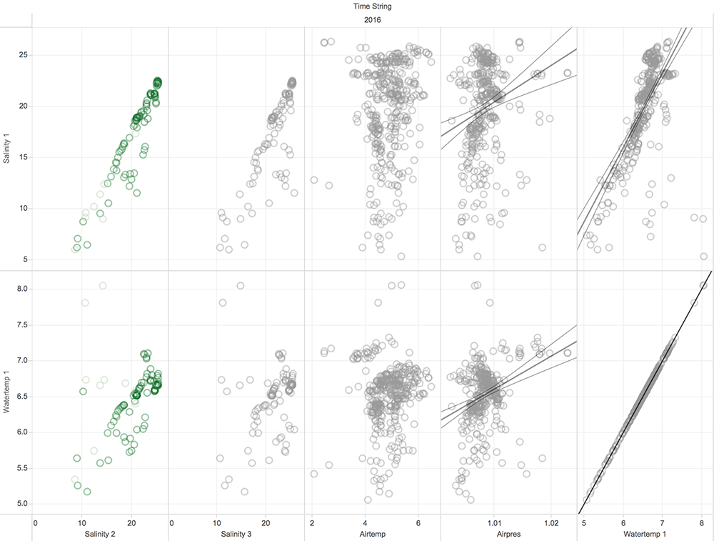
The next step was to investigate layout options that best support Kastner’s lab’s questions. We considered two main methods of visualization: small multiples, and parallel coordinates. Both methods support the analysis of many different variables simultaneously. Ultimately we chose small multiples due to its greater flexibility and because it supports broad exploratory analysis rather than optimization which is more suitable for parallel coordinates.
USER TEST FINDINGS
- Version one had UI controls on a left side-pane. In our user test we received feedback that it is taking valuable space which could be used for the Map
- Oceanographic field studies are usually deployed for 10 to 15 days and the date selector can be smaller.
- Change the Surface salinity v/s Time to scatter plot and not timeline series.
- User wanted to drill down by dates. We incorporated small multiples Map view in our next iteration.
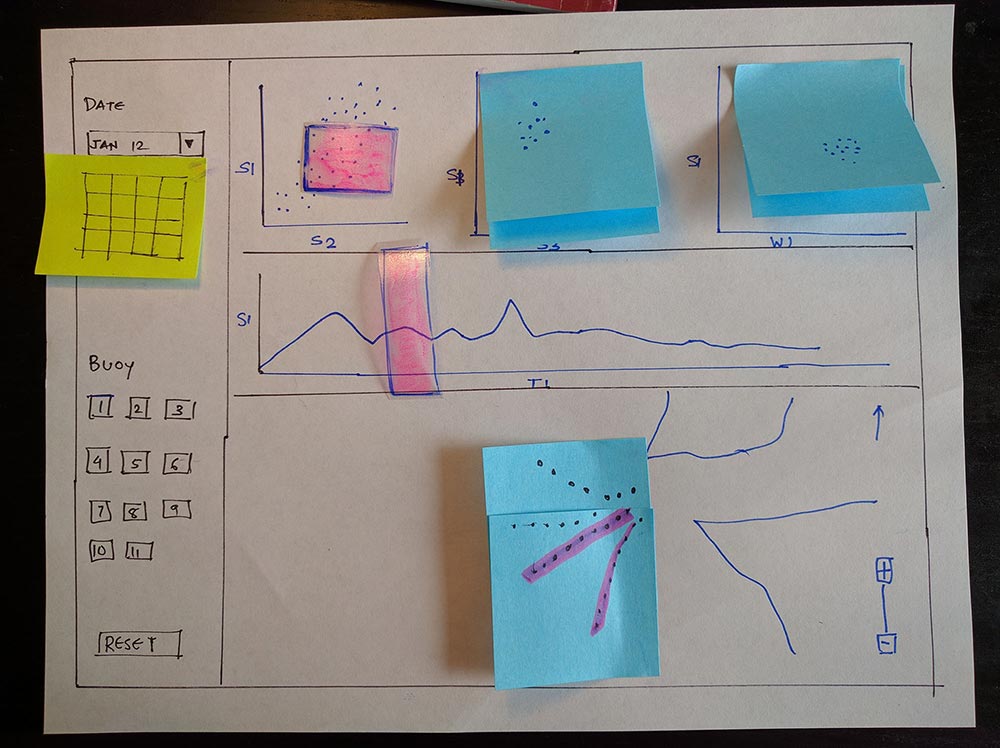
High Fidelity Functional Prototype
Tableau Prototype
With this prototype we wanted answers to specific data interpretation and encoding questions.
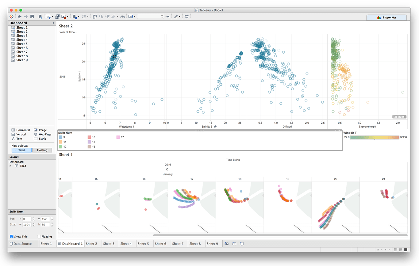
USER TEST FINDINGS
- Transpose the X and Y axis for scatter plots because usually oceanographic data it is useful to see other parameters as functions of surface salinity.
- No need to color encode the buoy in the Map. Just hide the unselected buoy. It more useful to see just the selected buoy than getting context by seeing other buoys.
- Small multiples map view is useful.
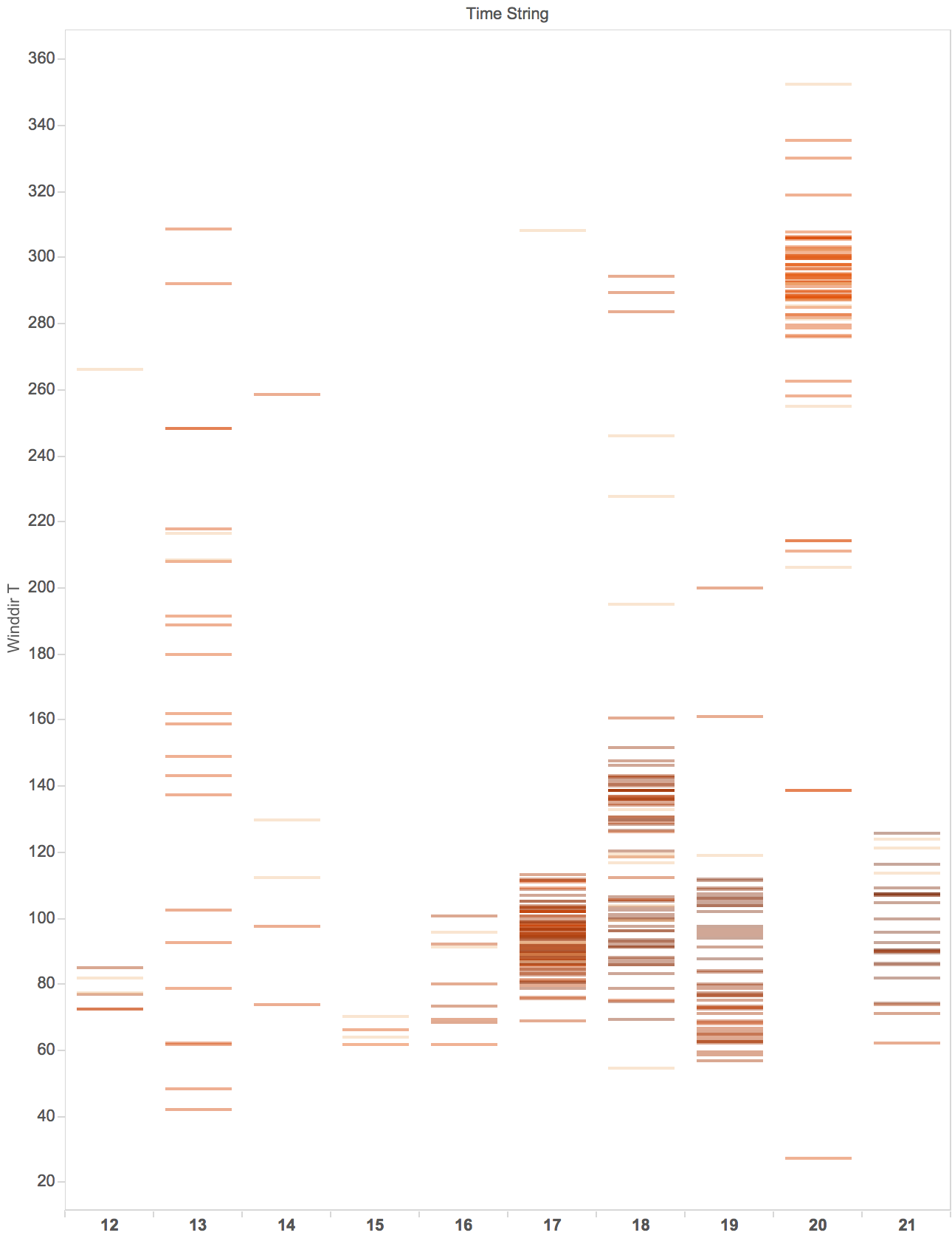
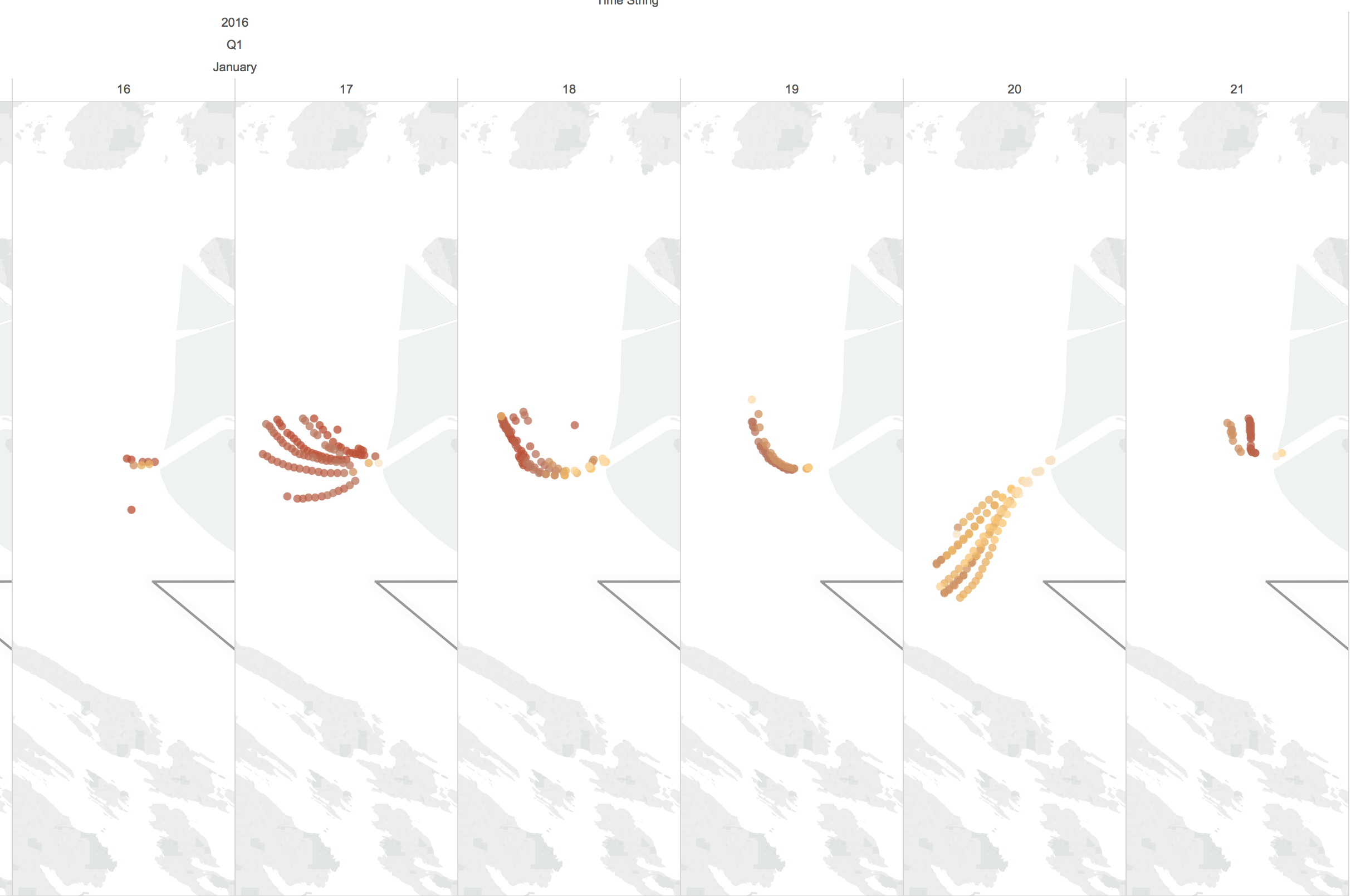
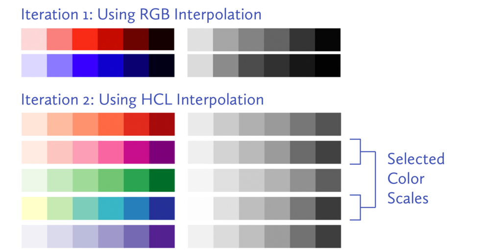
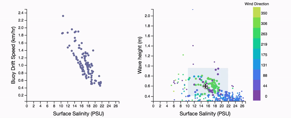
Choosing perceptually correct color palette
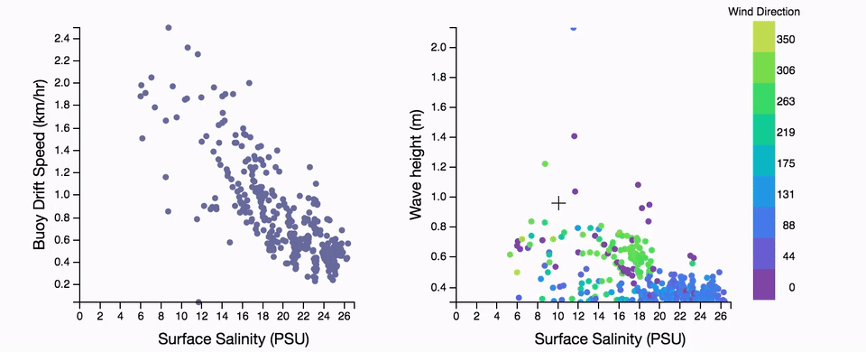
In one of our graphs we needed an additional encoding to represent wind direction. Our initial encoding used arrows indicating the cardinal direction of the wind, however our collaborators had difficulty finding clusters of wind direction. We realized that although the data type of wind direction was continuous, during initial analysis the ability to group samples was more important than evaluating changes in direction. Color encodings are a good fit for categorical or nominal data.
When encoding data with color, the choice of color palette goes beyond informational hierarchy, visual design and aesthetics. The RGB color model is designed for hardware and not for the human eye. Encoding data by interpolating in RGB is not uniform for human perception and hence produce data distortion. For example, if using the RGB color model, changes in shades of yellow are more nuanced than red.
We experimented in LAB and HCL color spaces to produce a color scales which is uniformly distributed for human perception. In the image for sample color scale, interpolating between a shade of yellow and blue leader to different color spectrums
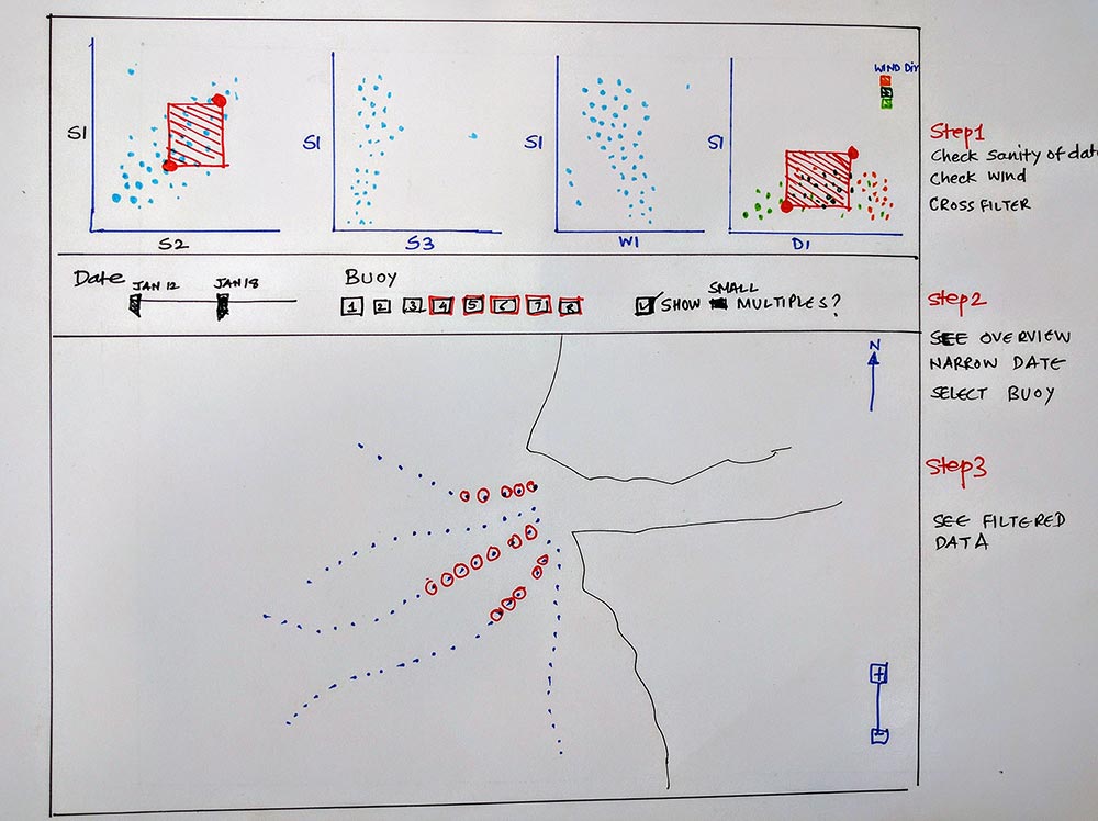
Development
Final prototype iteration. Try it online here.
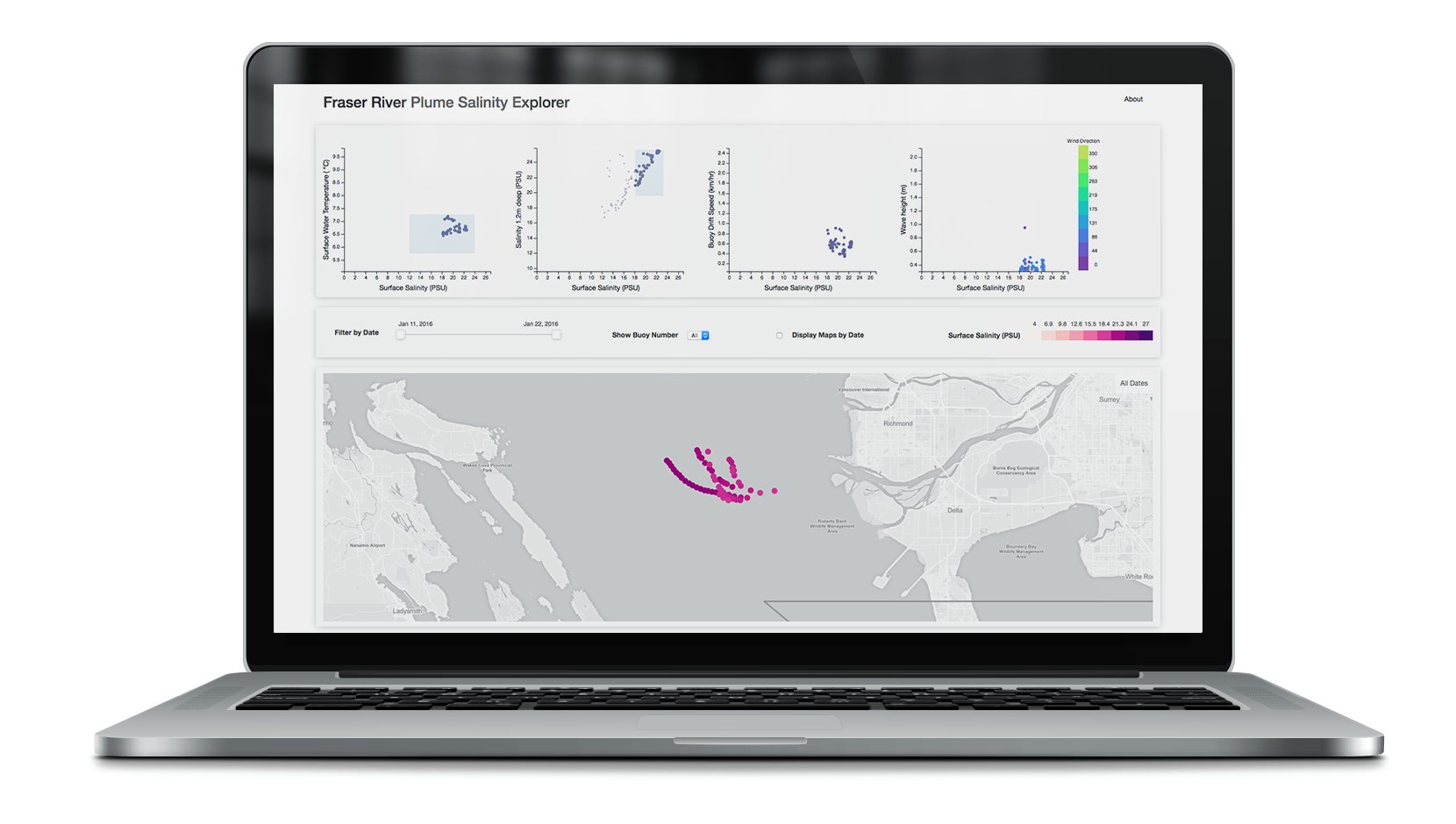
Our final design iteration incorporated cross filtered graphs and maps implemented primarily using D3.js and MapBox.js. Development was primarily done by me and Hyun. We focused on first implementing the features that would have the greatest impact for our collaborators. Some of our internal reach goals included a responsive layout, a flexible script to normalize and clean raw SWIFT data, and an interface to create custom scatter plots.
Outcomes
Our final design was extremely well received not only by our sponsor’s lab, but also piqued the interest of Oceanography PhD candidates from the University of Washington. Our sponsors have enthusiastically requested to expand on the original project to standardize and develop the tool further. Some suggestions for the new version are customizability of the scatter plots, a more precise method to select data points for cross filtering, and an improved workflow for importing new data.
Future Work
This project was a sponsored by Civil and Environmental Engineering Department at University of Washington to explore the potential of visualization standardization in oceanography. We are continuing the standardization efforts more formally now in collaboration with faculty from Civil and Environmental Engineering.
Next steps are
- Create library of acceptable color scales for specific oceanographic parameters.
- Define standard map visualization style for different contexts of surface, depth, currents.
- Create a standard serializable data format.
Additional information about the project can be found on our research paper, which was written largely by our teammate Chris Chung.
Other Projects
product
01
Helping physical therapy patients adhere to their exercise regimen
view solution
web-app
02
Helping instructors deliver better eLearning experience
view solution
Visualization Standards
03
Helping oceanographers build visualization standards
view solution
Physical Computing
04
An intelligent device to monitor healthy backpack use
view solution
Prototyping
05